Wednesday, April 8, 2020

Lepin 15002 Cafe Corner with full interior on every level (not Lego)


Hey what's up brick fans?  Hope you are all staying safe and healthy during this pandemic season.   Right now, the government strongly advises all of us to stay home and self-isolate. If there's a silver lining in all this, it's that I have lots of time to spend working on my modular buildings.


Thanks to COVID-19, I have now finally completed all of the modifications to my Lepin 15002 Cafe Corner modular.  If you're not familiar with this building, Lego designed this building to house a Cafe on the main floor, with the upper floors being occupied by a hotel, as evidenced by the large signage attached to the side of the building.  Well, that's what it was supposed to be, because this building was completely devoid of any interior finishings, so you had to just use your imagination about what it could be on the inside.  You can find my build and review posts,  part one and part two on my other blog Its-Not-Lego.blogspot.com.

Around the time I was building the Lepin Cafe Corner, I was also building the Hsanhe mini shops.  I had the idea to move one of the Hsanhe mini shops - the Sweet Shop, into the main floor.  Here's my build post of the Hsanhe Sweet Shop.  Since then, I've been gradually working towards furnishing the interior of the Cafe Corner, my version now renamed to the Sweet Shop and Hostel.

Change Log


  • July 2016 - ordered the Lepin Cafe Corner and Hsanhe mini shops
  • Sept 2016 - build Cafe Corner and Sweet shop
  • Apr 2017 - disassemble Sweet shop and integrate into Cafe Corner main floor, redesign main floor exterior
  • Jun 2017 - furnish second floor with hostel reception and lounge area, rebuild Hotel sign to read Hostel
  • May 2019 - replace the 32x32 baseplate of the modular, furnish third floor
  • Sept 2019 - third floor gets new bunk beds
  • Oct 2019 - add floor tiles to all three floors
  • Dec 2019 - revise main floor to include seating area
  • Jan 2020 - revise third floor to include 3 piece bathroom
  • Feb 2020 - replace all second and third floor windows


Exterior views

The most significant exterior enhancements include re-working the sidewalk area and changing the first floor facade.  The front door was relocated to the side and a circular glass display and signage added in it's place.  All the windows have been updated as well.  

One of the Sweet shop staff is giving out free samples to entice customers to come in and shop.  

Front Left Side View
Changed the Hotel sign to read Hostel.   Normally, there's a hotdog cart parked out front next to the Hostel entrance, but they took the day off apparently.

The famous Hostel sign.

Front Right Side View


The original green baseplate that came with the set was replaced with a brown one.  A covered service entrance provides an alternate access to the Sweet shop.

Rear Left Side view


Rear Right Side View
The second floor footprint is extended to provide an outdoor smoking area that leads back into the hostel lounge.  Trash cans on both first and second floor.

Service Entrance to Sweet Shop,  Second Floor Smoking Patio

Main Floor 

The main floor is now fully furnished with what used to be the Hsanhe Sweet shop.  The interior colour scheme is a nod to the original set, but everything else is pretty much new. That includes the workspace with oven, mixer, sink and drawers.  The circular display in the corner can be rotated to display different sweets.  A custom counter with cash register also houses more sweets.  The floor is fully tiled as well.
Prep Area, Rotating Display, Counter with Cash Register

There are even more baked goods next to the entrance.  The Sweet shop normally employs three to four staff who all take turns in cleaning, making, selling and marketing the wares.
Closer look at Prep Area and Rotating display

Even more baked goods are available next to the comfy seating area.  Each table gets overhead lighting.  Business is good.
Additional Shelves and in-Store Seating for 4 patrons

Second Floor

The hostel occupies the second and third floor of the modular building.  The second floor is fully furnished and tiled with the hostel reception area and lounge.  As you come up the stairs from the street, the reception area is on your left.  There is a water cooler and coffee machine for the customers enjoyment.  A brightly covered rug defines the relaxing lounge area.  Magazines, newspapers and a TV are free to use.  Fresh flowers also help to liven up the lounge.


Today, the hostel manager is using his computer to update the Hostel's website.  At the reception area, a satisfied guest is checking out.  Access to the outside smoking balcony is via the lounge, however Hostel staff kindly reminds their guests that smoking is bad for your health.

The third floor

Stairs lead to the third floor which is furnished with two bunk beds, a dresser and a computer desk.  Access to the communal bathroom is provided with each stay.
The bathroom has a sink with mirror, toilet and toilet paper, and a shower with hot and cold water.


Though it's hard to see, the shower stall has a glass partition wall. Please clean up after yourself when you are done using the bathroom. Thanks.

Maximum occupancy is 4 people.  I would love to be able to add another floor to the hostel so that men and women could have their own floors, but I can't really justify getting another Cafe Corner modular just to add an extra storey.  For now, it's mixed accomodations at the hostel.

How convenient that fresh coffee is just down the stairs.

As I was writing up this post, I wanted to say that I've completed all the changes I wanted to the Cafe Corner, except, now I'm thinking I might add a skylight to the roof to let more light into the sleeping floor.  Oh well!


If you still can't get enough, here's the links to my other posts about the evolution of Cafe Corner/Sweet Shop/Hostel.

Sweet shop moves into Cafe Corner.

Hostel moves into Cafe Corner

Further revisions to the Cafe Corner


Anyways, thanks so much for staying until the end of this post!  I hope you've enjoyed looking at the pictures as much as I've enjoyed sharing them with you.
Stay safe and wash your hands!   Bye!

Saturday, April 4, 2020

Honey, I Shrunk the Sembo Japanese Shops (Not Lego)!

I modded my Sembo shops!


Hi brick fans, thanks for dropping by!  In case you are new here, my blog BricksandFigs is about reviews of not Lego minifigure I find on Aliexpress and showcasing my custom brick builds or as sometimes referred to, MOCs.

In today's post, I will show you the three changes I made to the recently acquired Japanese shop sets made by Sembo brand.   For my initial build pics of these shops you can find that post here.   Ok, let's go!

Change #1 - Adding a roof to the sushi shop


In this before picture of the sushi shop, you can see it has no roof, whereas all the other three shops do have roofs.  To be consistent, I wanted to add a roof to the sushi shop.  The easiest way to do this is to put another post on the right side and then attach a cross beam across the top.  This will then provide support for a new roof plate covering the entire shop.

Change #2 - Adjust the counter heights

Sembo made the shops bigger, so you can appreciate all the little details but one thing I noticed is that they are slightly bigger than minifigure scale.

 In the case of this before picture of the takoyaki shop, you can see that the counter height is nearly the height of the girl minifigure.  If that was in real life, the counter height could be close to 5 feet tall.

 The counter height of the ramen shop is ok, until you realize those ramen bowls will probably be too high to eat out of, while sitting on the stools.  This is also a before picture.

Lastly, the shaved ice shop is also way too high.  There's no way the girl minifigure is going to reach the kakigori without her wearing it in the before picture.

 On most of the shops the counter is 3 studs high, so I'm going to reduce it to 2 studs if possible.  This should make the shops more minifigure friendly.

 Change #3 - Adjust the shop widths


All of the shops presently sit on a 16x8 stud plate, so when you display two of the sets besides each other they take up 32 studs, which is the size that is occupied by a normal modular building.   This would be fine, except I want to add in sidewalks to make the appearance consistent with my other modular buildings. Pictured above is how the shops looked before I modified their widths.

My sidewalks are about 8 studs deep.  If I subtract 8 studs from 32, I get 24 studs remaining.  So the challenge is to get 2 shops side by side within 24 studs.

The results


Here are the Japanese themed Sembo shops with all the changes applied.


The sushi shop underwent the most changes, but I still couldn't get the counter height as low as I wanted.  I was able to add the roof and move the signage to the front.  The width was significantly reduced from 3 seats to only 2 seats.  The ramen shop counter height was reduced and the shop width was only slightly decreased.  The red lantern of the ramen shop was shifted from the side to the front.

Here's how the shops look around back.


Here's the newly modified Takoyaki shop and shaved ice shop.  As you can see, the counters are much more accessible.  The biggest challenge on these two shops was preserving the fabric banners.  They take up a lot of room, so there's a bit of overhang.  The red lantern on the takoyaki shop was also moved from side to front.

Here's the rear of the two aforementioned shops.

For most people, they would probably stop here, having accomplished the ambitious challenges, but I decided to go one step further and placed the shops on 16x32 baseplates complete with sidewalks and a brick wall.

 Some WIP pictures


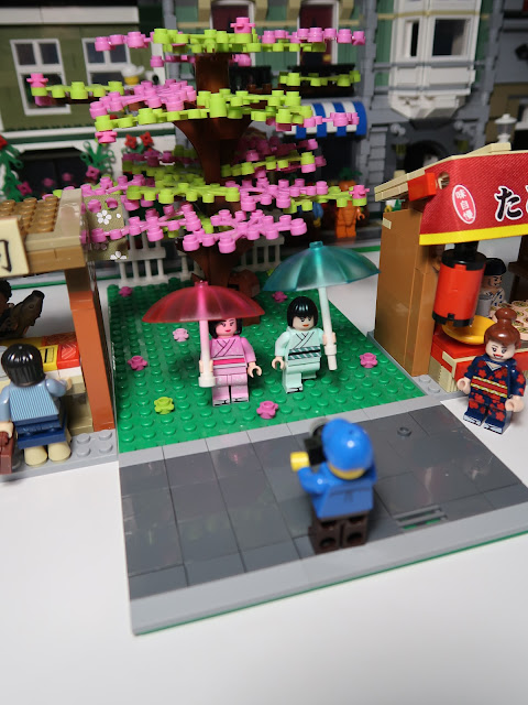
I really wanted that Asian feel, so I completed the display with a large cherry tree placed in a central courtyard.

The entire display is comprised of 3 16x32 baseplates, two for the shops and one for the parkette/courtyard.

I don't have the baseplates permanently attached, because sometimes I'll want to display it this way.


Well, that's it!  I hope you enjoyed looking at how I modified my Sembo shops and made a display for them.   Please note that you cannot simply take the shops as they are and downsize them.  I had to pull a lot of bricks from my brick stash and basically re-design and re-construct each shop from scratch.

Saturday, March 7, 2020

Hsanhe 6411-2 McDonalds restaurant MOC modular building gets a drive thru lane!


Hey, what's up, brick fans?  Today I'd like to give you a look at the latest updates to my McDonalds modular building. 

Here's a bit of background about this modular if you are new here.  The Hsanhe brick brand made a set of six small store fronts, each having about 200 pieces and included 2 minifigures.  I bought all six of the sets back in July 2016 and have since incorporated those shops into larger modulars or have made them into their own small modular buildings.

The McDonalds modular started life as one of those sets.  If you'd like to see how it has evolved in my not Lego brick collection, feel free to check out my other posts.

https://its-not-lego.blogspot.com/2016/09/hsanhe-6411-2-fast-food-restaurant.html

https://bricksandfigs.blogspot.com/2018/10/hsanhe-6411-2-mcdonalds-restaurant.html

https://bricksandfigs.blogspot.com/2019/01/hsanhe-6411-2-mcdonalds-restaurant.html

Anyways, let's take a look at the latest enhancements!


In case, you haven't guessed, it's the addition of an actual drive thru lane. The lane widens the former baseplate by about 8 studs.  Although it seems trivial, the modification required me to rip out the previous baseplates and interior.  I used the 8x16 stud smooth surface baseplates from a couple of old Kazi brand fire station sets.

I added an extension and post over the drive thru lane to provide some continuity to the Mcdonalds restaurant.  I also made some minor changes to the takeout window, but I might have to adjust the height again.  I dunno, what do you think?  Is it too high or is it ok as is?


At the rear of the building, I added a new extension and repositioned the back door to open off to the side.  I made the awning 5 studs wide to cover the entire back door.  The rear extension is supposed to provide a secure room for supplies and deliveries  instead of just leaving them out in the open like that gray container.


The final modifications I made to the McDonalds restaurant was to add bigger picture windows to both sides of the building.  Initially I had planned for this building to be sandwiched in between other buildings, but with the added glazing, this modular could be placed as a stand-alone unit in a city layout.


I used smooth tiles over the picture windows so that I could just pop them out for easier access to parts of the restaurant.


Here's an overhead shot of the building with roof removed.  Tiling the extended are off the back is low priority and I'll probably get to it soon, unless I decide to re-do the back area.


 Other than that the interior remains the same as before with a seating area and stand up counter with trash bin.  And yes, I still need to make/print some stickers for the menu signage over the counter.

No changes to the roof either. It comes off in two pieces.


I'm pleased to report that there has been no turn over of the staff at the McDonalds since the last time we looked in and everyone continues to be fairly happy in their job.


Patrons come and go, so we get some regular guests and some new guests.

We got a small party of seniors visiting today plus the airline pilot who is picking up some takeout from the drive thru in his sporty convertible.


Here's a few more shots.


Thanks for popping by and see you next time!